Most "AI built my website" demos stop at a rough draft that looks like every other template. I wanted to see how far the workflow goes when you treat it like a real client job: a written brief, a tight design system, and a deployed site at the end.
So I built Sushi Hayate — a landing page for a high-end (fictional) sushi restaurant — as a freelance portfolio piece. Stack: Next.js 14 (App Router), TypeScript, Tailwind CSS, and AI-generated imagery, deployed on Vercel. Here is the actual process, including the parts that made it feel premium instead of generic.
Start with a spec, not a prompt
The single biggest difference between a throwaway demo and something you'd ship is that I wrote a real specification before touching code. Not a one-line prompt — a brief that pinned down the things that are expensive to change later:
- Goal: drive the visitor toward one of two actions — Reserve or Get directions.
- Feeling in the first second: premium, trustworthy, appetizing.
- Constraints: three-color palette max, Japanese serif headings, no heavy animation library.
When the spec is explicit, the AI stops guessing and starts executing. Vague prompts produce vague websites; a constrained brief produces decisions you can defend to a client.
The design system that did the heavy lifting
Almost all of the "expensive" look comes from a small set of rules, locked in up front:
- Palette — black and gold, nothing else. Near-black background (
#0c0b09), warm off-white text (#f0ebe0), and a single gold accent (#c9a84c) for buttons and dividers. Restraint reads as luxury; a colorful palette reads as a coupon. - Type — Noto Serif JP for headings, Noto Sans JP for body. Thin weights (300) at large sizes. The light serif is what makes it feel like a restaurant, not a SaaS product.
- Buttons — outline, not filled. Gold border on transparent background, filling in gold only on hover. Outline buttons feel restrained and high-end; solid buttons feel like an ad.
- Whitespace as the main ingredient. Luxury is subtraction. Generous padding, short lines, nothing crammed.
None of these are clever. They're just decided in advance and applied consistently, which is exactly what AI is good at holding onto across a whole codebase.
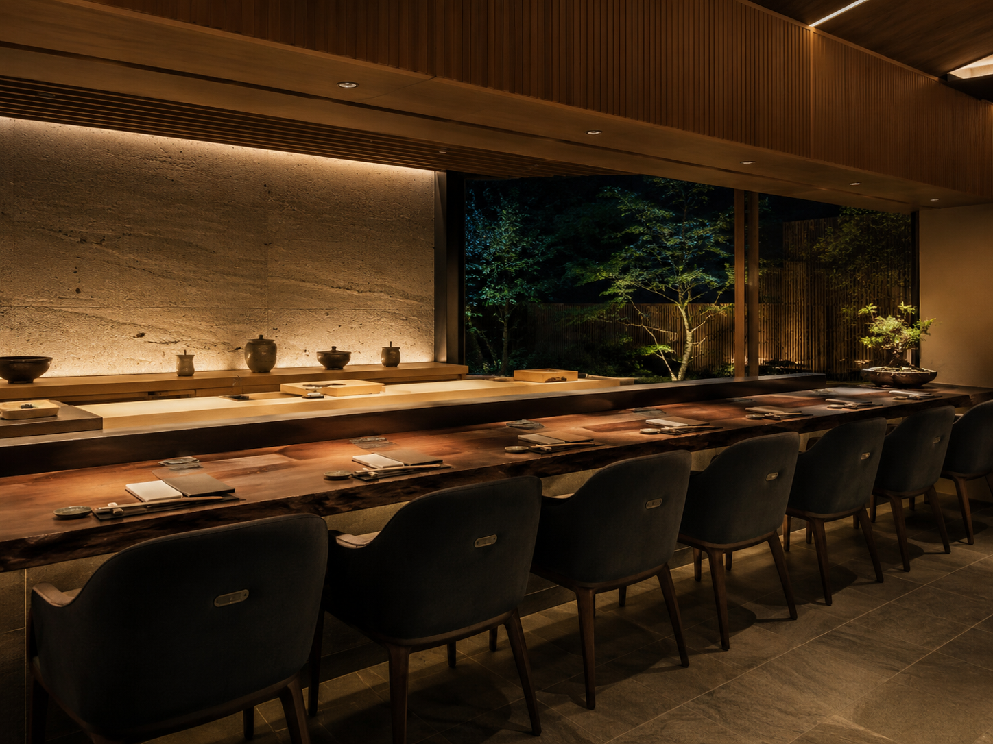
Structure: a single page that guides the eye
The page is one scroll, eight components, each a clean Tailwind section:
Header → Hero → Concept → Menu → Gallery → Access → Reservation CTA → Footer
The layout follows an F/Z reading pattern — the eye moves top-left to right, then down — and every section quietly points toward the same destination: the reservation. The menu builds appetite, the gallery builds trust, and the CTA is waiting right after the moment the visitor is most convinced.
Breaking the page into small, named components also makes AI iteration painless. "Make the Menu cards tighter on mobile" touches one file, not a 2,000-line blob.
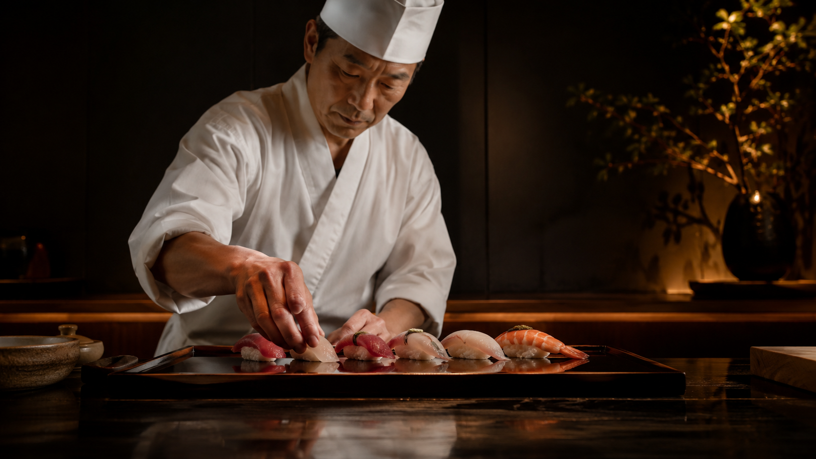
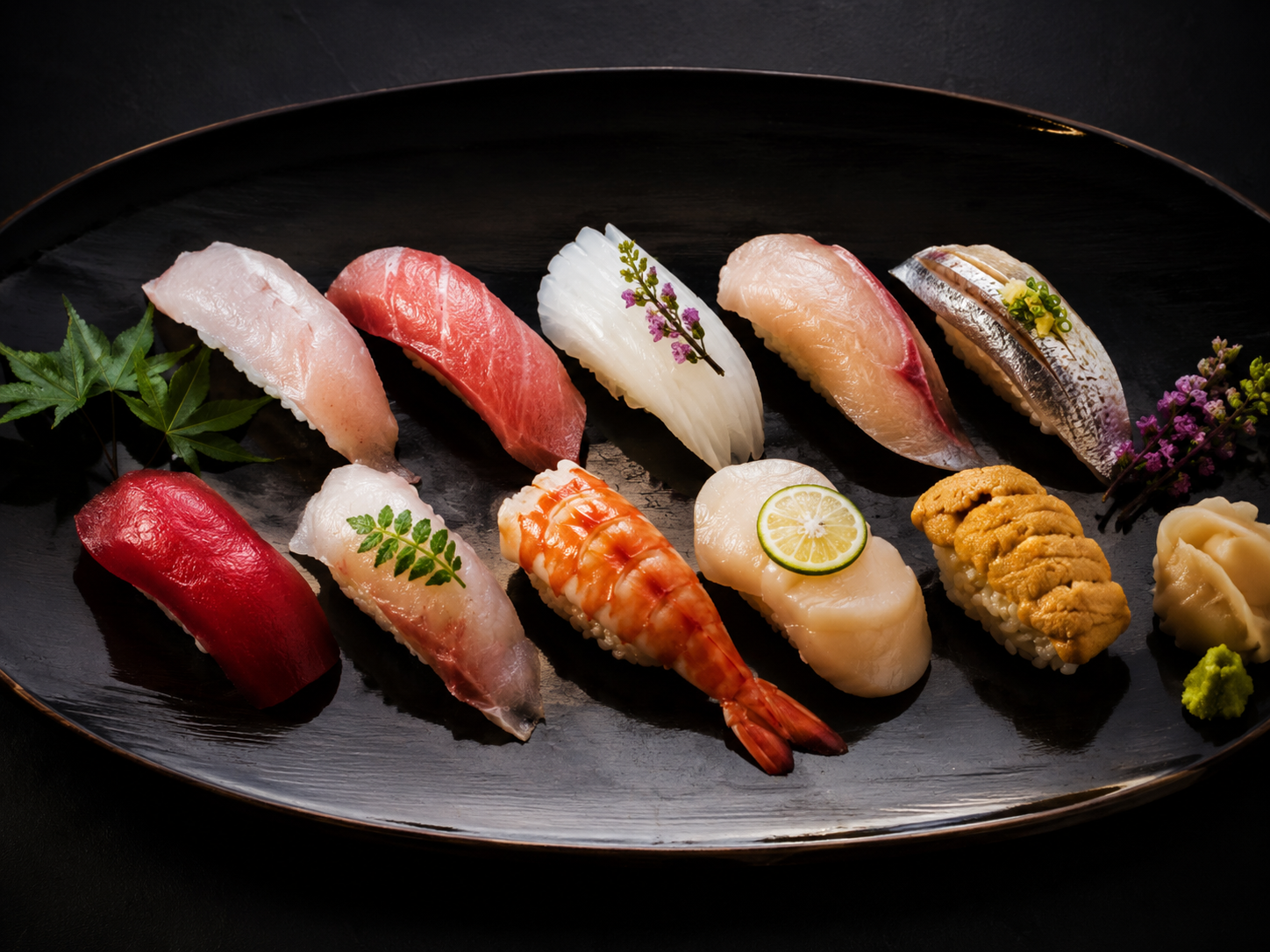
Imagery: where AI earns its keep
A fine-dining site lives or dies on its photography, and stock sushi photos look like stock sushi photos. Instead, every visual — hero, interior, menu, gallery — is AI-generated, art-directed to match the black-and-gold palette and the same warm, low-key lighting.
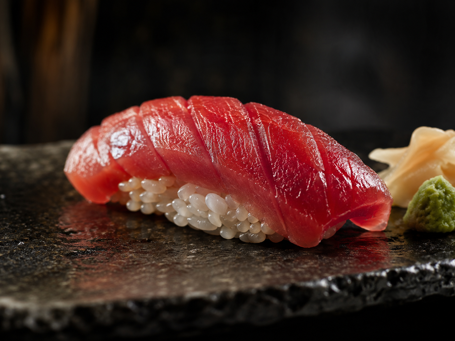
The trick is consistency: prompt for the same lighting, mood, and color story across every image so the set feels shot in one session, not pulled from five different sites. Dark overlays (40–60% opacity) over each image keep text readable and tie the whole page together.
What actually took the time
It wasn't the code. Tailwind plus a clear spec means the components come together quickly. The real time went into:
- Art-directing the images until the set was visually coherent.
- Tuning spacing and type scale so it breathed instead of feeling busy.
- Mobile pass — making sure the hero, menu cards, and gallery held up on a phone.
That ratio is the lesson: with AI, the bottleneck moves away from typing code and toward taste and direction. The build is cheap; the judgment is the job.
Takeaways if you want to try this
- Write the brief first. Palette, type, the one action you want — decide these before generating anything.
- Pick three colors and hold the line. Restraint is what reads as premium.
- Generate your imagery as a set, not one-offs. Same lighting, same mood, same palette.
- Componentize. Small named sections make AI edits surgical instead of risky.
- Spend your time on direction. The AI handles the build; you handle whether it's actually good.
The result is a portfolio-grade landing page that looks like it cost real money — built spec-first, with AI doing the heavy lifting and a human keeping taste in the loop. That, more than any single tool, is what the "AI web design" workflow actually looks like in practice.

コメント